Transforming
Rocket Carwash
The Challenge
Rocket carwash started with a pre-made logo built from a template provided by a national supplier of carwash parts. With one location, their logo fit the needs of the brand at the time. Since the organization has grown from one location to a nationwide presence, the brand no longer accurately portrays the efficiency, quality or elevated member experience that Rocket has since become synonymous with. Goals for this project included finding a way to bring the current brand into a new era of business, connecting with new and existing members, finding ways to cut costs from uniforms to signage, and pitching the new brand to C-suite executives in a way that was clear and concise.
The Discovery Process
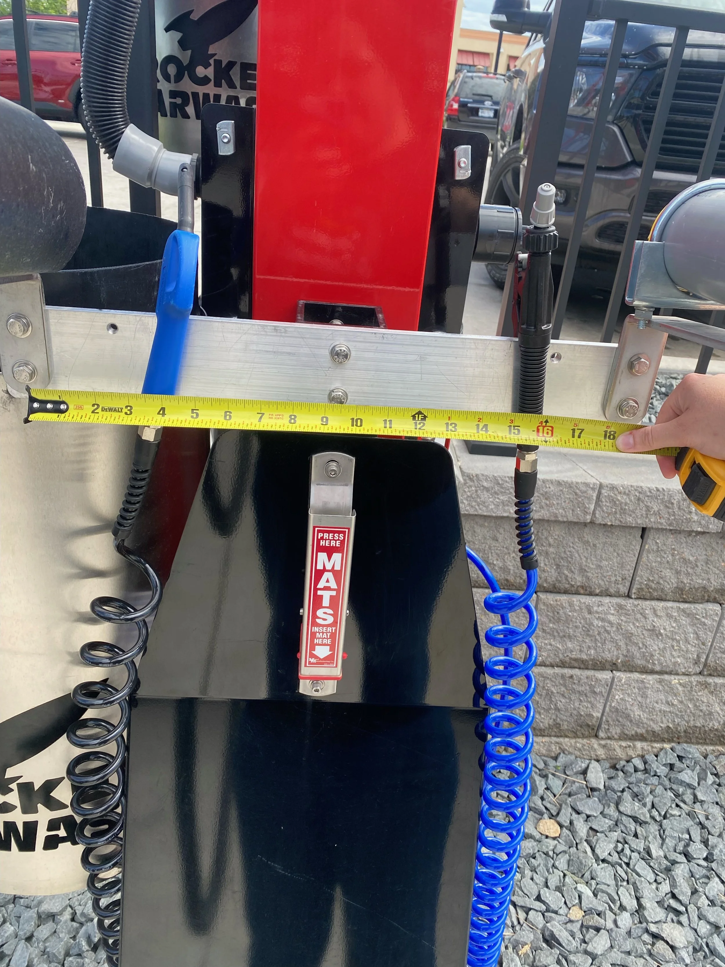
To build a foundational understanding of the brand and the customer experience, we visited each site to evaluate universal and site-specific needs. Some had structural issues that required necessary signage for optimal customer journeys, others had foolproof flow of traffic that made it impossible to penetrate. Our main goal of each site visit was to eliminate unnecessary signage to make room in the budget for main signage. Unique site factors such as sizing, messaging, and placement were collected and evaluated with leadership in order of importance and helped guide our development process. Ultimately, we uncovered a savings of hundreds of thousands of dollars across thirteen sites that would make the transition to a new and simplified brand, an easy “yes.” The cost of reconstructing signage was still a net gain among the amount invested into the initial builds.


Building Stakeholder Buy-In
Although our initial findings seemed like an obvious “yes” to our team, it wasn’t as easy to convince the final stakeholders that a re-brand was good from a combined monetary and aesthetic standpoint. The initial pitch was considered a waste of profits, despite the long-term net savings that each site would be able to be constructed at a lower value.
Our next proposal consisted of a staggered update, starting with all new construction sites built with a re-brand in mind, and using the profits and net savings from each new site to update existing sites. In addition to customer experiences, we proposed a full website redesign that would stand the test of time through each site update.
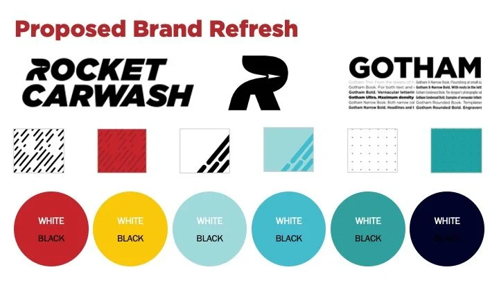
Immediate changes, such as uniform logos, would prove to be a major cost savings, as the current logo included 14 different blue gradients. Simplifying the logo meant cutting costs of embroidery thread from 40 colors to 4. Each proposal included options, such as the comparison between screen printing vs. embroidery, to take it an additional step further.

The Launch Plan
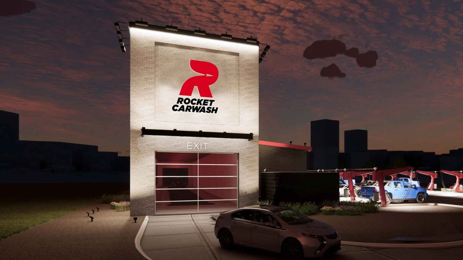
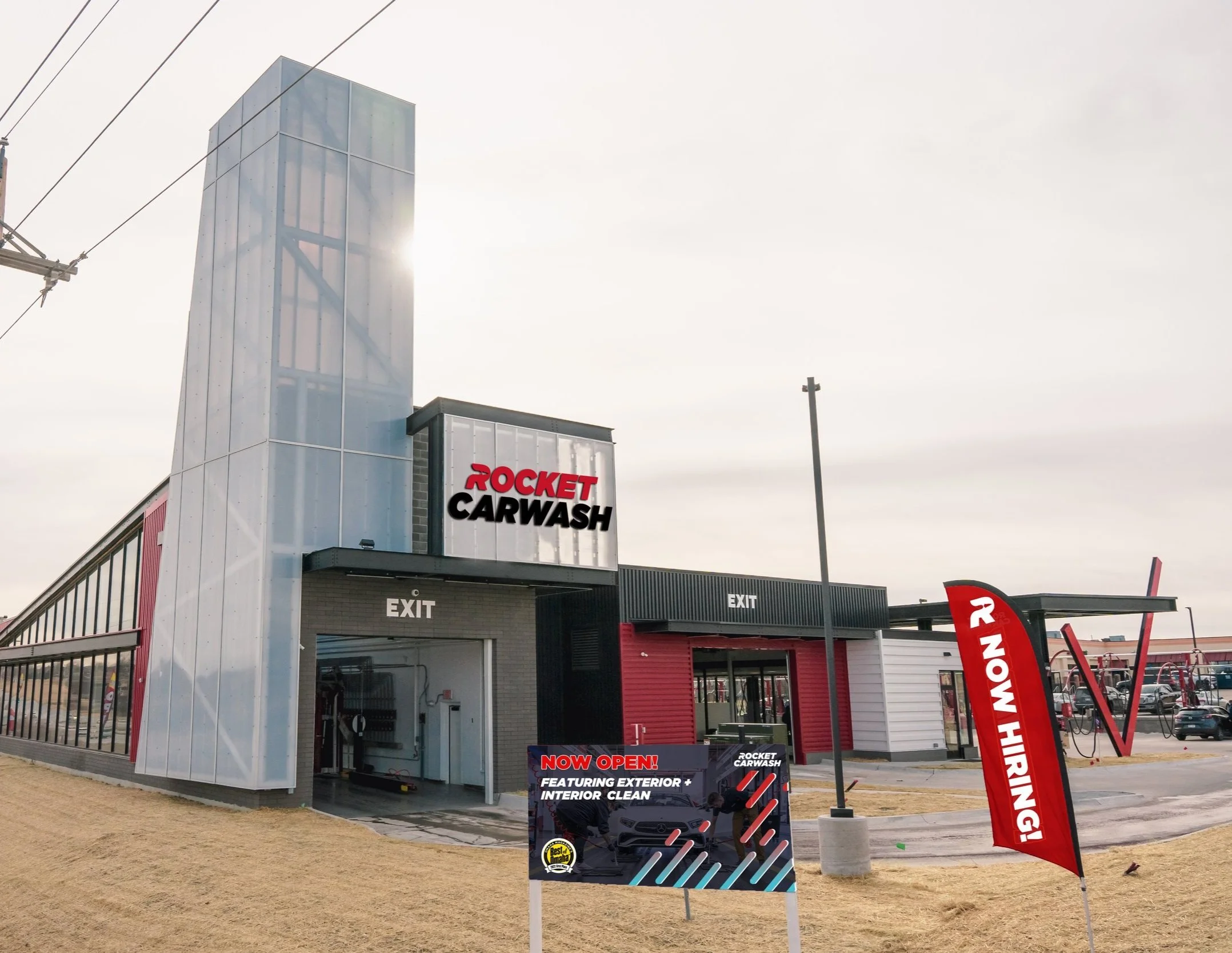
The Rocket 2.0 Brand launch plan was developed for a phased roll-out, based on size of project and potential customer impact. As the first customer experience interaction and the largest site branding expense, exterior signage was a key focus. A large mark with text underneath aimed to strengthen the new brand recognition and become a step above other traditional carwash competitors in the area.
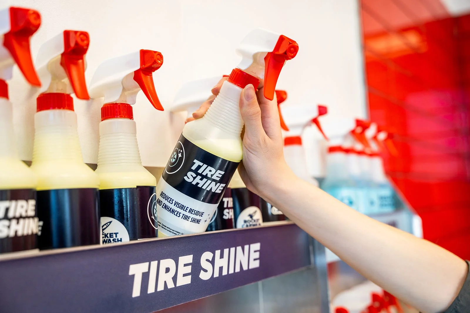
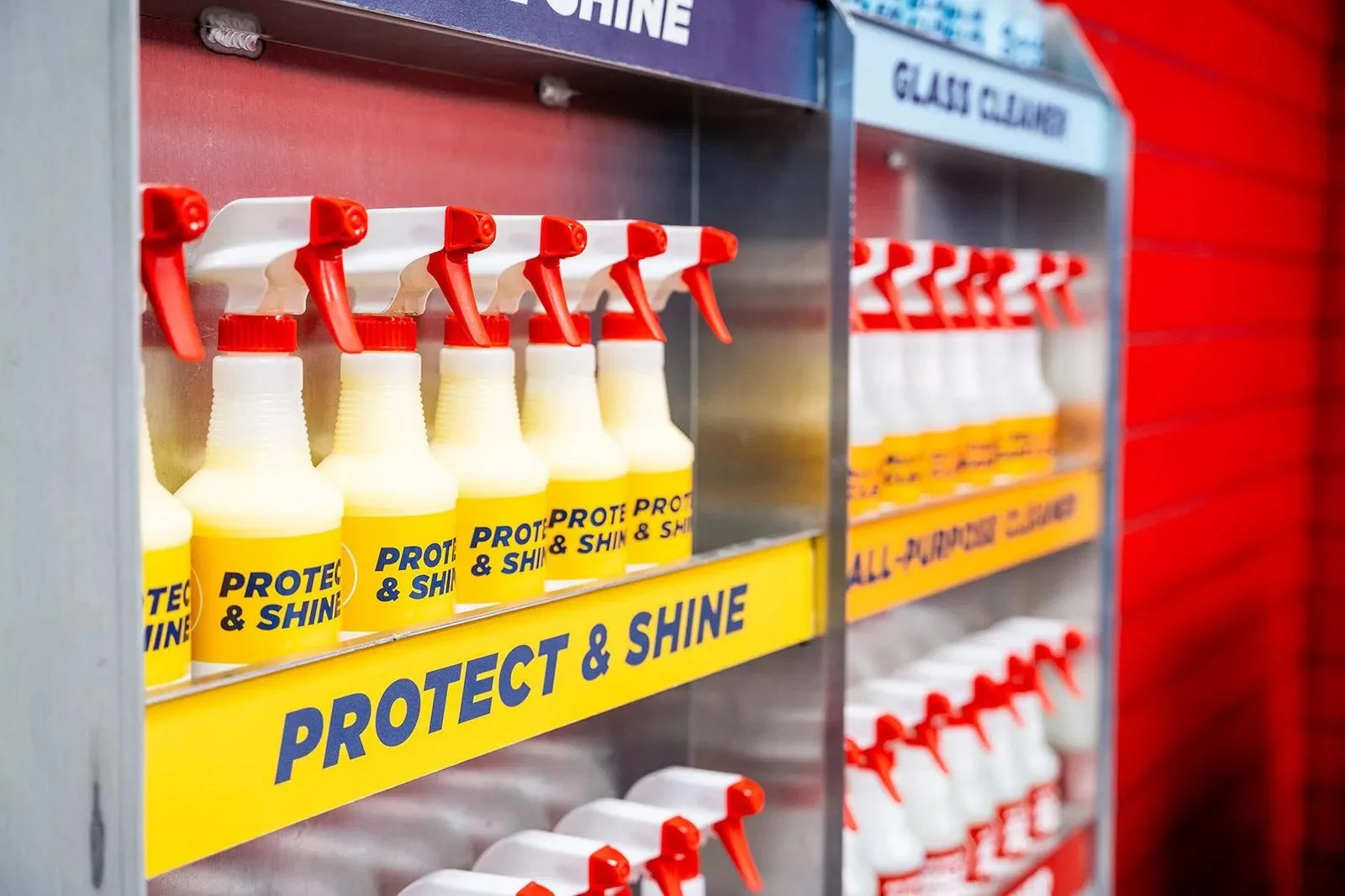
While primary site signage would take several weeks to fabricate, other quick turnaround projects provided confirmation that the new brand guidelines would succeed in terms of recognition, readability, and financial savings. Small added brand touches allowed for uniformity in brand presentation and elevated the consumer experience. For example, branded spray bottles for car detailing products were used as a way to test out the strength of the new brand through a unique and distinctive application. In a grab and go environment, the spray bottle labels need to be clear and concise for quick decision-making and customer comprehension. Color was a key factor as certain products can only apply to the exteriors of cars while others are either multipurpose or interior only. This application ensured our color palette was broad yet specific enough to apply to multiple use cases unique to the industry of Rocket.